Case Study · AI Systems Design
Designing a Learning Engine, Not a Video Generator
An Adaptive Learning Architecture, Tested With Real AI Tool Use
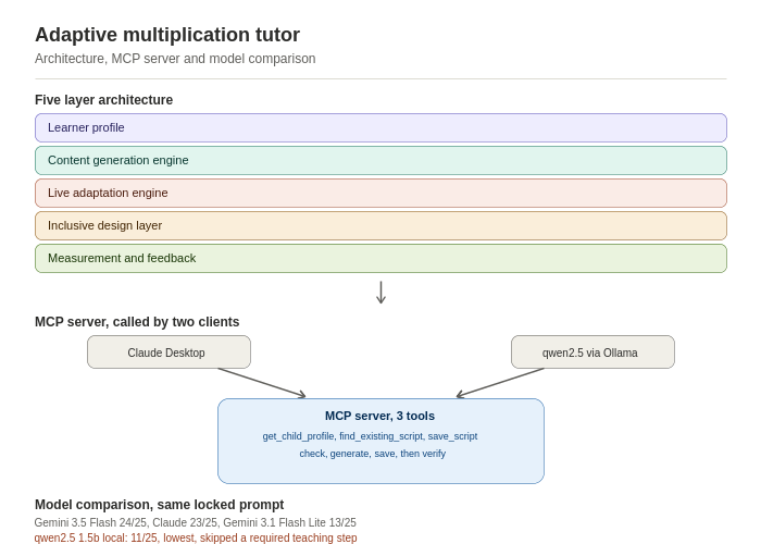
The starting brief was simple: build an AI tool that teaches children multiplication using short video lessons. The obvious answer is a video generator: type in a fact, get a video back. I deliberately built something else.
A video generator treats every output as disposable, regenerated fresh each time with no concept of what a specific child already knows or how they learn best. What I wanted to design was a learning engine that happens to deliver through video, with personalisation logic sitting underneath the content rather than inside it.
The first real design decision was separating two things that are easy to conflate. Surface personalisation changes how a lesson looks: a different counting object, colour palette, narrator voice. Structural personalisation changes how a child is actually taught the concept: sequential counting versus building a new fact from one already mastered. Mixing these is a real failure mode. Swapping a teaching method without checking whether a child is ready for it can embed an incorrect mental model. The architecture treats them as structurally different from layer one.
That thinking shaped a five-layer system: a learner profile layer (static + dynamic, with special considerations as independent parameters, not a binary toggle), a content generation layer separating script writing from assembly, a live adaptation layer defining mastery as an explicit rule, an inclusive design layer treating accessibility as first-class, not bolted on and a measurement layer tracking mastery per fact, not per video watched.
The document left an honest gap: it describes how a model should behave. It doesn't prove the model actually does. That gap led me to the Model Context Protocol (MCP), which lets a model call real functions outside itself. I built a Python MCP server with three tools: fetch a child's learner profile, check whether a script already exists for a fact, and save a new script for reuse. I then connected it to a live client and watched what the model actually did.
The most instructive moments were the failures. The model initially declined to call the profile tool unprompted, reasoning that pulling a child's data into an unrelated conversation wasn't something it should do without being told why. That was exactly the right behaviour for a system handling children's data, and it appeared on its own. Once the profile matched the real schema, the model's reasoning changed in kind: given three attempts on one fact (correct, incorrect, correct), it correctly flagged the fact as not yet mastered against the three consecutive clean attempts rule, then cross-referenced the child's low repetition tolerance without being asked to. When asked to save a new script, it noticed there was no save tool available and stopped to ask, rather than pretending the problem was solved.
What I keep coming back to: giving a model structured real context doesn't just make answers more accurate. It changes the shape of its reasoning. That is the actual argument for architecture work like this.
One Scroll, Everything That Matters
A Personalised Morning Briefing Built Around What I Actually Care About
Most news apps assume everyone wants the same feed. I wanted mine built around the specific mix of things that actually shape my day, so I built a personal pipeline that pulls it together automatically every morning.
It opens with geopolitical news and travel disruptions, since those two are inseparable for me, a flight delay rarely happens in isolation from something bigger going on in the world. From there it moves into a quick brain teaser, a small math or critical thinking puzzle, just enough to wake up the problem solving part of my brain before the day's actual problems show up. Then a stock market watch, a pulse check on what moved overnight and why. After that, the latest in science and technology, and a dedicated section on what is new in AI, the field changes weekly and I wanted a standing way to keep up rather than relying on stumbling across it.
All of it lands in one place, summarised down to a two minute read, every morning. Building it was as much an exercise in prompt design and content pipelines as it was in deciding what actually deserved a place in my own morning, which turned out to be the harder design problem of the two.
Meet Mochi, My Sandboxed Assistant
A Personal AI Agent, Kept on a Short Leash by Design
I named my personal AI assistant Mochi, and the first real decision I made about it had nothing to do with what it could do. It was about what it shouldn't be allowed to do.
Giving an autonomous agent full run of my primary machine made me genuinely uneasy, the kind of access that sounds convenient right up until something goes wrong with a file it shouldn't have touched or data it shouldn't have seen. So instead of handing Mochi the keys to my actual computer, I isolated it inside an Ubuntu virtual machine and wired it up to Slack as its interface. I get to talk to Mochi like I would do with any assistant, while everything it actually does stays contained inside a sandbox that never touches my real environment or my real data.
Inside those boundaries, Mochi runs as a genuine one-stop personal assistant. It plans trips, helps with shopping decisions, sets timed reminders, and catches on-the-fly notes I would otherwise lose track of during the day. The boundaries were not a limitation on what I built, they were the precondition that let me actually explore agentic AI without gambling with my own data to do it.
From Curiosity to a Toggle Switch
Building This Site, Theming It Twice, and What Two Days Taught Me About My Own Process
This whole site started as curiosity, not a plan. Claude Design had a new feature worth playing with, and rather than read about it, I wanted to actually build something real with it. What started as poking around became the first working prototype of this portfolio's dark theme, built one section at a time rather than designed end to end up front.
Most of the real work was ordinary and unglamorous, exactly the kind of thing I tell people delivery is actually made of. Feeding in the real content. Framing a layout where someone could move through sections naturally, never wondering where to go next. Keeping every piece of writing short enough to actually get read. Getting the templates and toolkits to work as something you could interact with directly on screen as well as download, instead of just listing what existed. Adding accordions where content was getting long, since a page that scrolls forever is its own kind of poor user experience, no different from a status report nobody reads because it ran too long.
Once the dark theme actually worked end to end, a different idea showed up: what if I could try a completely different look without rebuilding everything underneath it. That meant going back into code that already worked and refactoring it on purpose, separating styling from structure so the same content and the same layout could carry two entirely different visual identities. That refactor was the quiet, structural decision that made everything after it easy. The light theme came together with very little friction once that separation existed, and the toggle switch, the part that now reads as the most polished, came last and fastest, because the foundation was already doing the hard work.
The toggle also reflects something I care about that goes beyond aesthetics. It defaults to whatever the visitor's own device is already set to, light or dark, and only changes if they actively choose otherwise. Designing for someone else's preference by default, while still giving them a clear way to override it, is a small decision, but it is the same instinct that shows up in how I run programmes for actual stakeholders.
All of it, prototype through toggle, happened across two days. Not because speed was the goal, but because building it the way I build anything else, structure before polish, working increment before full vision, made two days enough.